Showing posts with label Canada. Show all posts

Monday, June 14, 2010

Level Ground Trading

“Founded in 1997, Level Ground Trading of Victoria, BC is dedicated to trading fairly and directly with small-scale producers in developing countries, and to market their products in North America, offering their customers ethical choices. Level Ground selected Subplot Design to examine their brand and packaging system and help the company connect with a broader consumer audience.

The packaging platform takes the thought further: the producer is the real hero. Celebrated with intimate, inviting photography “in situ”, the farmers grace innovative zip-locking, authentic kraft bags, with a label that declares Level Ground’s expertise and deep knowledge of the origins and taste profiles of each of their coffees. From the most prevalent 300g bags, to 2lb club-store bags, 5lb coffee store “eco-cubes”, and 6 and 12-pack shipper displays, the brand comes alive consistently but with rich variation to tell the whole story of Level Ground.”

Agency: Subplot Design
Country: Canada

Friday, March 26, 2010

Wer


Great packaging concept from Alexandre Michaud who is a student of Graphic Design professor Sylvain Allard.

"The simplistic thinking in eco-packaging, would suggest that all it needs is to take a recycled Kraft cardboard and the job is done. Unfortunately, it's much more complicated than that and demonizing plastic over paper is another non-sense. In fact, there are as many solutions as there are different packages and each one should be developed taking into account production methods, materials, transportation and many other factors that ultimately determine the true lifecycle of the product.

However, the reduction approach remains the most easily measurable element of ecodesign. Indeed, by reducing the amount of material, it reduces the weight of the interventions in upstream and downstream production because there will be less material to produce, to collect and to recycle.

Recently, I asked my students to develop a package that consisted of grouping two products in an approach inspired by the 3Rs, Alexandre Michaud has developed this double pocket for a gel and body moisturizer for man. The word Wer means Man in Old English. I think it’s a very nice concept; what do you think?"

Designer: Alexandre Michaud
Country: Canada

Via: The Dieline / Packaging Uqam


Friday, March 19, 2010

Dsquared2 He Wood


 "Known for dressing the hottest artists and celebrities, designers Dean and Dan Caten are the driving force behind the uber-hip design house Dsquared². As twin brothers with the same vision, this talented duo strives to design cutting-edge pieces that make a statement on and off the runway. Their signature scents, however, take on a totally different approach. Meet He Wood and She Wood—the brand's debut fragrances inspired by the twin's love of nature from their homeland of Canada. These woodsy-inspired spritzes are artistically encased in show-stopping bottles adorned with a modern touch of their organic namesake, and each scent set apart with subtle differences: fresh notes for men, citrus top notes for women. Strong yet hardly overpowering, He Wood and She Wood make a subtle statement so your personal style shines through—exactly as the Caten twins intended"

Country: Canada


Monday, February 22, 2010

Arborite champagne

 
Packaging design for a bottle of Champagne to celebrate the 60's years of Arborite.

Designer: Annabelle Fiset
Country: Canada

Thursday, January 28, 2010

Gotta Moo

"Gotta Moo’s package focuses on the most eco-friendly method for milk packaging. This greener milk packaging solution will be made out of Sugarcane Bagasse molded pulp paper, coated inside with sugarcane lignin and printed with vegetable based inks, all based on food safe materials. Bagasse is an annually renewable plant resource and is compostable and recyclable. This can replace plastic and plastic coated packaging, which is currently used in the food/beverage industry today. This packaging solution does not rely on oil extraction and it also minimizes green house gas emissions. This new molded pulp milk packaging solution could be an eco-friendly vision of the future."

Designer: Narani Kannan
Country: Canada


Tuesday, January 26, 2010

Neige


Inspired by the technique used to make ice wine and by Québec's very particular climate, Neige (meaning snow in English) ice cider was born out of this Canadian province's terroir, which has the extreme cold winter temperatures needed to produce the concentration of sugars for its creation.

Agency: Chez Valois
Country: Canada

The cidery La Face Cachée de la Pomme approached Montreal-based Chez Valois to redesign the brand identity and packaging of the product line. The goal was to reafirm the leader and trendsetter position of this premium brand in the ice cider category as well as reinforce its recognition on the international market.


To achieve this, a clean and minimalist design was created based around a pattern of snowflakes that can be found throughout the product line. A lot of subtle elements were also included in the design of the packaging, such as a peel-off label on the back of the bottle that allows to include more information on the history of the cidery and on the fabrication process of ice cider. Custom packing tape was also created to help identify which of the three versions of the product can be found in the shipping boxes.


Thursday, October 15, 2009

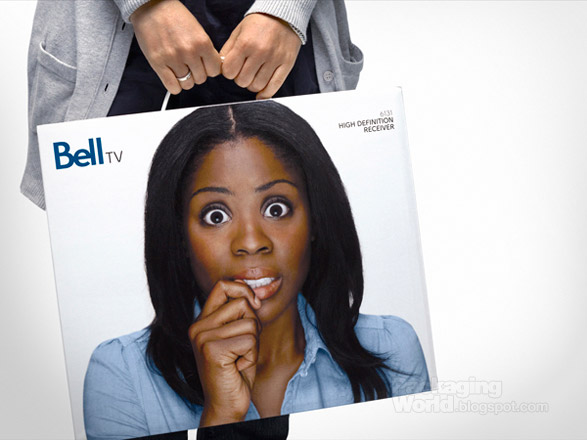
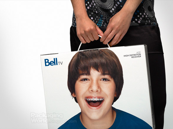
Bell TV

Great packaging concept from Montreal based design studio Lg2boutique. "Packaging that brings out a full range of emotions. Inspired by the completely new Bell brand platform, which takes its tone from simplicity, optimism and a friendly attitude toward clients."

Bell TV

Bell TV

Bell TV


Bell TV

Bell TV Packaging Side View


Agency: Lg2boutique
Country: Canada

Thursday, March 26, 2009

Xococava

Xococava (pronounced shoco-cava), an extension of its big brother restaurant, Cava, is whimsical hybrid of a stand-up tapas bar crossed with an ice-cream parlour. Inspired by Spanish and Mexican cultures of chocolate and Italy's love affair with geleto, Xococava features artisanal ice-cream and hand-made chocolate. With such unusual creations as prune/Pedro Ximenez sherry ice-cream and choriso, dark chocolate truffles, the store caters to Toronto's burgeoning "foodie" culture.


Concrete created an identity program that utilizes strong typographic forms. This extens to the chocolate "periodic table" that uses two-letter combinations to identify the different flavours of chocolate.

Agency: Concrete
Country: Canada
Via: Packaging UQAM

Monday, March 9, 2009

Gee Beauty

GJB is one of Canada's leading independent agencies, it delivers compelling and creative business solutions to clients that deliver results.

"Its unabashed, bold and contains an appropriate mention of Houdini, because what a few inspired minds did with the basement of a beauty salon is nothing short of magic. From product conception to branding and design, this upscale women hygiene salon is the brainchild of some of the finest talents at GJP."

Agency: GJB
Country: Canada